Dear Moderator,
Welcome to my blog, I hope you enjoy looking at my coursework final pieces which are under this post. Also, under the label of coursework is all my work that I have done for my coursework including research and planning, final pieces and evaluation.
Thanks,
Catherine Robinson
Friday 7 May 2010

Thursday 6 May 2010

Wednesday 5 May 2010

Tuesday 4 May 2010


Friday 16 April 2010
Evaluation Task 1

The title of my magazine is “Amplified.” This fits in with the genre of my magazine which is Indie Rock/Pop music and the artists in this genre use amps and guitars. The models who feature in my magazine are wearing clothing that would normally be associated with the Indie Rock/Pop genre of music and how artists would dress in magazine such as Q and NME. My front cover picture included a guitar which often is featured in music magazines – this fits in with the genre of the magazine where the artists play guitar. In my Contents page my model is biting tape from a cassette – once again this fits in with the magazine being a music magazine and makes it individual.The colour scheme of my magazine is black, white and burgundy. This challenges the forms and conventions of music magazine because often a lot of colour is used and burgundy isn’t a colour that is normally used. I wanted to make my magazine individual and different so therefore I thought the colour burgundy would suit my magazine. The music artists are represented as being confident, professional and relaxed. This conforms to the forms and conventions of real media products. The genre of my magazine is Indie Rock and Pop. This is shown because of the title of the magazine and the models are wearing Indie style clothes and the front cover picture includes a guitar. The bands included are from the Indie Rock/Pop genre. This uses the conventions of music magazines because lots of magazine are from this genre and use the previous techniques to show this. The font and style of my magazine is very consistent. The same font is used throughout but different sizes and font colours are used. This challenges the conventions because normally a variety of fonts are used but at the same times conforms because it looks consistent and there is a variety of different styles.
The layout of the front page uses the conventions of a real music magazine. The picture is in the centre with the title of the magazine in big above it. A strip line is used and a variety of article headings. The Contents Page includes a variety of pictures, headings and numbers which are convention of a magazine. To make my magazine different the title of the page is along a strip line of pictures on the left hand side. The double page spread uses conventions of a music magazine such as a large picture.
Thursday 15 April 2010
Evaluation Task 2

On the left is an image of Katie White from the Indie band the "Ting Tings" and on the right is the model Hannah on the front page of my magazine "Amplified."Katie and Hannah are both similar weight and height and wear little make-up. Despite some physical differences they are both looking away from the camera to show an element of secrecy and mysteriousness. They are both young musicians who play Indie Rock/Pop music which is the genre of music that my magazine features. Although Katie is wearing more extravagant, individual clothing than Hannah, they are both holding their guitars which not only fits in with the genre of the magazine but shows their rebellious "rock chick" appearance. Despite a female being featured on the front page of my magazine I still think my magazine appeals to both men and women because of the colour scheme and because the model isn't made to look overly girly.
Evaluation Task 3
The previous voice clip is about the key features of my magazine and why the magazine is publishable.
A publishing company makes information available for public view. The process of publishing includes acceptance and negotiation, editorial, design sales and marketing stages, editorial stage, design stage, sales and marketing stage and printing.
Magazine can be distributed through the mail; through sales by newsstands, bookstores or other vendors, or through free distribution at selected pick up locations. The worldwide magazine distribution company are well known and have distributed many magazines such as NME,Q and Rolling Stone magazine. I would use a distributor such as the WWMD because the magazines they distribute are from the same genre of music as my magazine and they deal with a variety of different magazines including specialist magazines.
The money for my magazine would have come from advertising in my magazine such as adverts for new albums and gigs. Business loans can be obtained from the local bank to fund the magazine as you need enough financing to fund the company though its first year of business. i would also use sponsors to get my magazine started.
Instutionally my magazine is similar to Q and NME because they are from the same genre of music and would appeal to a similar target audience of males and females and 16-24 year olds.
Evaluation Task 4

My target audience is 16-24 year old males and females who have an interest in Indie Rock/Pop music. In the picture above I have included a variety of things that my target audience would be interested in. These include Indie band such as "The Smiths," social networking sites such as "facebook" and go to fast food restaurants such as "Mcdonalds." They would mostly be students from both working class and middle class backgrounds. They would buy the magazine because it features the latest artists and music which attracts the younger audience. Also, because the colours are gender neutral so that the magazine attracts both males and females.
Evaluation Task 5
Using Slideshare, I have produced a powerpoint on how I attracted/addresed my audience in my final coursework pieces.
Question 5 media
View more presentations from catrobinson.
Evaluation Task 6

This is a picture of my magazine on Photoshop. Before starting this AS Media course I had never used Photoshop before. Since I first started I have learnt loads about the programme. Using a magnetic lasoo I cut round my images. This was difficult at first but after using tools such as the rubber tool I was able to neaten the edges of my image. Using a website called http://www.dafont.com/ I was able to find a font I wanted to use as the title of my magazine. I copied and pasted it into photoshop and adapted the sizing. For my subheadings and font on my contents page and double page spread I used a Bevel effect to make the font stand out in an effective way. This made it stand out and look unique. I made a black strip line at the bottom of my front page using the rectangle tool and used a burgundy font to make it stand out amongst the black background. On my contents page I also used a strip line on the left hand side of the page and used an opaque effect on the pictures. It took me a long time to get the pictures exactly the same size but it was worth it in the end. On my double page spread I used the ruler tool to mease the columns and make sure they were all the same size.

This is me on photoshop making changes to my magazine. I spent a lot of time using these school computers as I had no access to photoshop from home and I was determined to spend as much time on it as possible. I also used programmes such as slideshare to share my pitch to everyone and blogger to blog all my ideas and progress along the way.

This is the camera I used to take all the pictures for my magazine. I was able to change the settings to adapt the photos. Using lamps I was able to adapt the lighting to make the pictures look better. I used a website called http://www.picnik.com/ to adapt my photos and change the contrast.
Wednesday 14 April 2010
Evaluation Task 7

In the image above I have used a split screen to compare my Final Front Page and Contents page to my first preliminary pieces. Since doing my first preliminary pieces I have learnt loads more including about Photoshop and the generic conventions of a magazine. I have learnt how important photography, fonts and colour schemes amongst other conventions are vitally important to magazines. I have realised that to produce a quality magazine you must plan and research extensively. In my final piece I was able to use a variety of different techniques on Photoshop to make my magazine look professional. As I have a subscription to Q magazine I was able to get inspiration from a magazine that has a similar target audience to my magazine. By having a clear target audience I was able to produce my magazine to meet the needs of the said audience.
Thursday 25 March 2010
Final Pieces
For the last few week I have been working on improving my draft front cover, contents page and double page spread. By using the peer assessments and teacher feedback I have tried to improve my coursework as much as I possibly could. I added bar code, issue no, price to my front cover and changed the image so the head wasn't chopped up. I made the picture bigger and added more headings to fill the white space. I used more pictures in my contents page and even had a strip line on the left hand side full of small pictures of the artist included. I used pictures from my front cover and double page spread in my contents page. I changed the colour so that it was consistent and fitted in with the rest of my magazine. For my double page spread I improved my cutting, I made the fact box stand out more and enlarged the heading. I also did another montage of small pictures along the top to fit in with my contents page and to fill in the space.
Ident Image

This is the image I've taken that I'm using as my ident because it fits wth the title of the magazine "Amplified" because it's a picture of an amplifier and has the title of the magazine in white font so that it stands out.
Tuesday 23 March 2010
Consistency
After finishing my mock ups and seeing my feedback, I decided that my magazine was not consistent enough. I wanted to keep the black and white theme but decided to use the background colour of my double page spread for the font colour on my black and white front cover. For my contents page I used black and white pictures but also used the background colour from my double page spread. This meant that my final pieces will have a consistent theme between them.
Friday 12 March 2010
Teacher Feedback
Front Cover - Add bar code, date/issues no, price. sort out image - head looks to chopped. Spacing need adjusting - too much white space. New images are much better - consider replacing
Contents - needs more pictures. Go back to your research - it doesn't look conventional. Tie in pics from front cover and double page spread
Double page spread - looks good - best piece. Improve/tidy up cutting. Heading needs enlarging and fill spaces (adjust text)
* Create a house style through colour/font which runs through 3 pieces.
Research/Planning level: 3
Practical Draft: 2/3
Tuesday 9 March 2010
Terminology
Conglomerate - A group of smaller companies owned by a larger company
Vertical Integration - Process in which distribution and exhibition are done by the same company
DSN - digital screen network - The film is put on a disc instead of reels of film, transferred by internet, 240 screens in 210 cinemas in the UK
Logistics - How a film is transferred and transported
Escapism - Escape from the real world and it's problems and divulge yourself into what you're watching e.g go to cinema to forget about reality
Social realism - Representation of real life - deals with social life
35mm print - The standard reel that the film is processed on
Tim Bevan - the founder of working title
Pre-fabricated set - set already built
Four Quadrant audience - film appeals to young/old and male/female
Viral marketing - word of mouth, passing on of marketing message - use of internet e.g. facebook status, text messages
Synergy marketing - where two companies join together to benefit both e.g. having a soundtrack on a film, orange Wednesdays
Above the line marketing - adverts, posters, billboards - company pay, you don't choose to see it
Below the line marketing - interviews, reviews - company paid, you choose to see it
Stock writers/Directors - Associate with the same film company e.g. Shane Meadows (Warp Film) and Paul Greengrass (Working Title)
Product Placement - A product used in a film to advertise it e.g. Jude Law drinking coca-cola
Friday 5 March 2010
Ident

For my ident I used the programme paint. I used a black background so that it would stand out,used comic sans font and shortened the title to just "Amp" The letters are outlines so that they stand out against the background.
Market Research Questionnaire
1)What do you think to the name Amplified?
Bradley - I like it
2) Are my colour scheme appropriate to the genre of the magazine?
Bradley - I like the black and white scheme but think some colour should be added to the front cover
3) Is the music featured on the magazine suitable for the genre?
Bradley - Yes, it fits in with the Indie genre of the magazine
4) How much would you be willing to pay for the magazine?
Bradley - £2
5) Is the magazine suitable for both males and females?
Bradley - Yes
6) Do you think the pictures fit in with the genre of the magazine?
Bradley - Yeah it fits in with the Indie pop music genre
7) Do you think my fonts are suitable for my magazine?
Bradley - Yeah but more fonts should be added
8) What magazine does it remind you of?
Bradley - Q and NME
9) What do you think to the graphology (layout) of my magazine?
Bradley - I like it but more pictures should be used on the Contents page
10) What do you like/dislike about my magazine?
Bradley
Like - the colour scheme
Dislike - the contents page layout
Tuesday 2 March 2010
The Soloist - Notes on Featurette
The Soloist is based on a real life story from a newspaper article. Steve Lopez is a LA Times Columnist who wrote the article on Nathaniel in real life. Steve humanises the problems that are happening in America. Joe Wright the director was wary of telling a story about a country he knew nothing about. A lot of time was spent with people such as Steve and Nathaniel from the real life story. Extras who had never done it before and real homeless people from the area were used. The Soloist was filmed on the real Skid Row. This helped them and provided jobs. Jamie was taught to learn the Cello for the role of Nathaniel. They only had 4 weeks to get the set ready and 50 members of the crew.
The problem with the film was that it was a sombre film and there was no happy ending because the film was based on a true story. The problem was trying to find an honest ending. The ending is left open and Joe Wright said that he "doesn't like to prescribe how an audience should feel at the end of the film."
The problem with the film was that it was a sombre film and there was no happy ending because the film was based on a true story. The problem was trying to find an honest ending. The ending is left open and Joe Wright said that he "doesn't like to prescribe how an audience should feel at the end of the film."
Sunday 28 February 2010
AFL target setting
Self Asessment

Peer Assessment 1
Good Variety of shots
Good use of mise-en-scene e.g props
Little variety in fonts and text size
Like the effect on the background of the front cover
Peer Assessment 2
Good use of colours on double page spread but a bit plain on the other two pages
Good use of pictures and a variety of shots especially the front cover as there is a guitar on the artist’s back
The material is all linked to the task, good use of cropping and resizing, but I think the photo on the double page spread would look better if it was not in the middle of the page
The front cover might look better with a little more text
The layout is generally good, especially text layout on the double page spread, variety of fonts and colours used
ICT is used well
Target Setting
Use different fonts and font sizes
Add more colour
Adjust photo
Add text on front cover
Tuesday 23 February 2010
How does the editing in Saw 2 construct the meeting about the relationship between characters?
The Saw 2 trailer has no continuity as it purposely uses a variety of quick shots from the film and recaps back to the previous film.
Flashbacks are used so people can remember what happened previously and can see that it's a sequel before the title of the film is revealed at the end. It is in non chronological order so that it creates the enigma code and the audience want to watch the film so that they fully understand what is going on.
Jump cuts are used throughout the trailer to create the effect of distortion. They also lead to the enigma code because they give a sense of confusion and make you want to know what is happening.
Cutaways are used in the trailer because you see the CCTV camera and then see the people on the CCTV camera. This is used because the audience want to know what is on the CCTV camera and then a shot is shown of the people on the camera.
Eye line match is used to show one woman and then see the woman she is looking at. This is used so that we wonder who the woman is speaking to.
Montage editing is used throughout the whole of the trailer as all the images are unconnected and are used to create the meaning of uncertainty and confusion. This makes the audience want to watch the film to find out what is going on.
Match on action is used when we see the police officer and then we see him pull the cloth of the CCTV camera. This is used so that we wonder what the police officer is doing or about to do.
Actors
Jamie Foxx
In The Soloist, Jamie Foxx plays a musician who develops schizophrenia and becomes homeless. He took the role because it mirrored his past. When he was younger, Jamie had a fear of going crazy. When he was younger he took drugs and ended up in hospital and he had a friend who spoke to him and told him he was going through post dramatic stress. Because of this Jamie could relate to his character Nathanial and wanted to go into the character deep. He wanted to open up ideas about schizophrenia and homelessness.
Robert Downey JR
In The Soloist, Robert Downey JR plays a journalist who meets Nathanial and decides to write a Newspaper column about Nathanial and his homelessness. He was asked by the director to be in the film and felt like he interacted the most with the other actors.
Friday 12 February 2010
Double page spread first draft

For my double page spread, I used the Eyedropper tool to find the colour of my background. I decided to use the colour of my models bow tie as the background colour. I also used a gradient effect to make the model stand out against a white glow amongst the colour of the background. I want to use this in my final piece. I have used this picture of the model because it's a high angle and looks like the model is looking up to the camera. We are able to get a clear view of the model and he is dressed smart which fits in with the genre of the magazine. This is the picture I want to use in my final piece. In my drawn mock ups I planned to have the picture on the left hand side of the double page spread. But I have decided to place the picture in the middle of the double page spread so that all the text fits around the outside and because the picture grabs your attention straight away which is what I plan to do in my final piece. I used a magnetic lasso to cut around the model and used a rubber to get rid of any bits that I didn't manage with the magnetic lasso. I have used a pull quote which is black and is placed over the model. This makes it stand out. I want to use this pull quote in my final piece but I want to use different effects to make it stand out even more. I have used the same font throughout to keep consistency. The title is in white to stand out and the name of the artist is in a bigger font so that it stands out. I used the ruler tool to ensure that the text boxes were the same size. I have used black font on the left hand side and white on the right. I think this looks effective but I am going to play around with different coloured fonts for my final piece to see which looks more effective. I have used a facts box on the side of my double page spread to give us more information about the artist and his musical influences and also because it adds something different which therefore engages the reader. I definitely want to use a fact box in my final piece but I want to make the box around it stand out more and experiment with different fonts and colours. After reading back through my article I have noticed there are a few typing errors which will be corrected for my final piece.
Tuesday 9 February 2010
Contents page first draft

For my contents page, I have continued with the theme of black and white from my font cover. I have used a gradient effect by having a bright white shine amongst the black background. I am unsure whether I will use this in my final piece or not. The picture I have used is in colour and is placed where the bright white shine is to emphasise the picture. I have not decided whether this will be the picture in my final piece or if I'll inclue others as well. Using the magnetic lasso I cut around the image, but for my final piece I will also use a rubber to neaten the edges. I have used the same font to keep the consistency which I will use in my final piece. The title "contents" is in capitals and big to make it stand out. The page numbers and title of article slant downwards which has makes it look different and therefore more interesting to read. I want to include this in my final piece. There is a title of the article including the model in the picture, which is bigger than the rest to stand out and attract the reader. I want to use this in my final piece. There is a regular section at the bottom which includes part of the magazine that regularly appear and I want to inclue this in my final piece to.
Friday 5 February 2010
Front Cover first draft

For my front cover mock-up, I have used the colour scheme of black and white because it looks more effective and the picture is able to stand out. The picture was originally in colour but by using a black and white effect, I was able to make it fit in with the rest of the colour scheme. I have decided after making my mock-up that I want my front cover to be in black and white instead of the colour schemes I experimented with previously. I took a picture of my model with a guitar because it fits in with the genre of the magazine. I will be using a different picture in my final piece because I want my model to be looking at the camera. I have used a black strip line at the bottom of the magazine with a white font because it makes the font stand out. I have inclued three bands who feature in the magazine on the strip line.I will be using this in my final magazine front cover. I have used Coverlines to give the reader more information about what is in the magazine. I will be using the same Coverlines in my final magazine cover. The title amplified is big and rests just above the models head, again looking effective. This is the font I will be using in my final piece.
Thursday 4 February 2010
Musical Influences fact boxes for double page spread
Here are some facts about the artist and other albums to recommend to the reader that I might use in my double-page spread:
Musical Influences
First Record you bought: "In the Shadows" by the Rasmus
Record that made you want to become a musician: "Red House" by Jimi Hendrix
Record that makes you sad: "You were always on my mind" by Elvis
Record that makes you happy: "Piss on you" by The Wannadies
Record that makes you want to dance: "Green Isaac" by Prefab Sprout
Record that reminds you of love: "Songs of love" by the Divine Comedy
Favourite Record: "Esp" by Miles Davies
"Love this? Then you'll like these..."
Elvis Costello: "This years model"
Ben Folds: "Supersunnyspeedgraphic"
The Wannadies: "Yeah"
Wednesday 3 February 2010
Photos for front cover and contents page


By using the website www.picnik.com, I have used a special effect called Duo-Tone to change the brightness and contrast of the pictures and to change them to black and white. My favourite's are the tenth one down because it makes the model look like a "rock star" and shows a sense of rebellion. Also, the sixth one down because the lighting makes the model stand out and it is different and unique.
Tuesday 2 February 2010


Monday 1 February 2010
Photos for contents page
One of these photos is going to be used on my contents page. My model is dressed in a blue dress with a beaded head band which makes her fit in with the Indie genre. She is biting cassette tape which fits in with it being a music magazine and gives a sense of rebellion. My favourites are the fouth one down because the model looks rebellious, the sixth one down because the lighting makes the model stand out against the white background and the seventh one down because it's a close up and looks detailed.


Sunday 31 January 2010
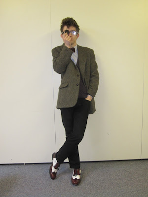
Interview for double page spread
Christie Inman-Hall is only 19, not that you would know it. His black rimmed glasses, bow tie and Harris Tweed Blazer give the etiquette of someone much wiser in his years. Sitting on Amplified’s black leather couch, Christie looks relaxed and tranquil about the whole interview. He ruffles his hand through his hair and utters a loud “why hello there” as we enter the room and greets us with a smile. A hand shake and a kiss on the cheek show us that Christie is well bought up and a traditionalist. Christie is the lead singer and guitarist of the band "My Dear Watson." Their first album “Long way round to nowhere” was released in 2008 and was an ultimate success, winning best album in the Amplified music awards. Christie is hoping they will have the same success with their future album called “End of the world ma.” Christie’s individuality and sophistication sure show us that there’s still a lot more to come from this young talent. Christie was keen to be interviewed after recently winning best album of the year for “Long way round to nowhere” inn the Amplified music awards.
1) How was 2009 for you?
Christie: It was long they should shorten the years down a bit.
2) Who is your biggest music influence and why?
Christie: Well, I often like to equate my work to a young Elvis Costello. I suppose there are lashings of Jarvis Cocker, perhaps an underlining influence of Chris Difford. I also like to imagine my lyrics can equal yet never surpass Ben Folds.
[Hannah, our cover star chimes in "ummm Ben Folds"]
I know right
3) Your new single "Nightmare Girlfriend" is to be released on April 4th, but what inspire you to write the song?
Christie: My work is private to me, [pauses] it's a personal catharsis. I try not to divulge my inspiration, I feel is lessons the gravitas of the song. [serious expression]
4) You are well known for you unique style, but what would you categorise your dress sense as?
Christie: I don't really tend to categorise myself - I suppose if I had to put a name on it, it'd be 'Professor-chic' nerdy, yet respectable, Just' like me... [laughs]
5) If you weren't a singer/songwriter what would your dream job be?
Christie: I'd like to be a teacher of an Actor - perhaps a professor of English or Drama.
6) Your knowledge of English is evident in the way you use your words, but which writers/authors inspire you?
Christie: I tend to find myself influenced by anything I've read, even if it's just an advert on the tube. More consciously I guess, I'm influenced by H.G. Wells and Philip K. Dick.
7) Your song "Castle Elsinore Blues" is written about Hamlet, but why does Shakespeare inspire you?
Christie: I trained to be an actor, and I fell in love with the written word - especially Shakespeare - he just wrote the most perfect words of all.
8) What's the most embarrassing thing you've done whilst performing your music?
Christie: As a guitarist, it's always really annoying to drop your plectrum - i do that a lot. [laughs] It got to the point where I was dropping my pick constantly - I felt so strongly about it that I wrote a song about it, it's called "oops (I dropped my plectrums)" - it's a hidden track on my first album. "Long way road to nowhere."
9) If you were to take a girl on a dream date, where would it be?
Christie: Where ever she wanted - dates are more of a celebration of my passion and affection for a girl, rather than an attempt to openly please myself. [winks]
10) When was the last time you played guitar?
Christie: This morning after I got out of the shower - I'd had an idea for a song. It's called "Elsalene court."
11) What do you think to social networking?
Christie: I love it - it allows me to get over my social awkwardness by typing colon-p constantly [:P]
12) When was the last time you cried?
Christie: Last night - I watched the series finale of 'Ugly Betty' - poor Matt. I'm weirdly attracted to Betty Suarez - she's so cute. [ummmm]
13) What's one think you want to do before you die?
Christie: Live
14) What plans have you got for the rest of 2010?
Christie: There's a future album coming up called "End of the world Ma" [reference to the 1949 film - White Heat - the original quote being 'top of the world Ma']
15) Are you currently single?
Christie: No. Neither can remember when we started going out but it was definitely before new year. [smiles]
Friday 29 January 2010
Photos For double page spread & contents
I am going to use one of these pictures for my double page spread and one for my contents page. My model is dressed smart and individual whcih fits in with the genre of my magazine - Indie. My favourite pictures are the sixth and seventh one down. I liked the sixth one down because of the low angle camera shot and the shadows on the picture. I also like the seventh one down because he is looking up to the camera and we get a clear view of his face and what he is wearing.


Subscribe to:
Posts (Atom)

