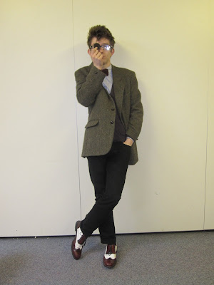
Christie Inman-Hall is only 19, not that you would know it. His black rimmed glasses, bow tie and Harris Tweed Blazer give the etiquette of someone much wiser in his years. Sitting on Amplified’s black leather couch, Christie looks relaxed and tranquil about the whole interview. He ruffles his hand through his hair and utters a loud “why hello there” as we enter the room and greets us with a smile. A hand shake and a kiss on the cheek show us that Christie is well bought up and a traditionalist. Christie is the lead singer and guitarist of the band "My Dear Watson." Their first album “Long way round to nowhere” was released in 2008 and was an ultimate success, winning best album in the Amplified music awards. Christie is hoping they will have the same success with their future album called “End of the world ma.” Christie’s individuality and sophistication sure show us that there’s still a lot more to come from this young talent. Christie was keen to be interviewed after recently winning best album of the year for “Long way round to nowhere” inn the Amplified music awards.
1) How was 2009 for you?
Christie: It was long they should shorten the years down a bit.
2) Who is your biggest music influence and why?
Christie: Well, I often like to equate my work to a young Elvis Costello. I suppose there are lashings of Jarvis Cocker, perhaps an underlining influence of Chris Difford. I also like to imagine my lyrics can equal yet never surpass Ben Folds.
[Hannah, our cover star chimes in "ummm Ben Folds"]
I know right
3) Your new single "Nightmare Girlfriend" is to be released on April 4th, but what inspire you to write the song?
Christie: My work is private to me, [pauses] it's a personal catharsis. I try not to divulge my inspiration, I feel is lessons the gravitas of the song. [serious expression]
4) You are well known for you unique style, but what would you categorise your dress sense as?
Christie: I don't really tend to categorise myself - I suppose if I had to put a name on it, it'd be 'Professor-chic' nerdy, yet respectable, Just' like me... [laughs]
5) If you weren't a singer/songwriter what would your dream job be?
Christie: I'd like to be a teacher of an Actor - perhaps a professor of English or Drama.
6) Your knowledge of English is evident in the way you use your words, but which writers/authors inspire you?
Christie: I tend to find myself influenced by anything I've read, even if it's just an advert on the tube. More consciously I guess, I'm influenced by H.G. Wells and Philip K. Dick.
7) Your song "Castle Elsinore Blues" is written about Hamlet, but why does Shakespeare inspire you?
Christie: I trained to be an actor, and I fell in love with the written word - especially Shakespeare - he just wrote the most perfect words of all.
8) What's the most embarrassing thing you've done whilst performing your music?
Christie: As a guitarist, it's always really annoying to drop your plectrum - i do that a lot. [laughs] It got to the point where I was dropping my pick constantly - I felt so strongly about it that I wrote a song about it, it's called "oops (I dropped my plectrums)" - it's a hidden track on my first album. "Long way road to nowhere."
9) If you were to take a girl on a dream date, where would it be?
Christie: Where ever she wanted - dates are more of a celebration of my passion and affection for a girl, rather than an attempt to openly please myself. [winks]
10) When was the last time you played guitar?
Christie: This morning after I got out of the shower - I'd had an idea for a song. It's called "Elsalene court."
11) What do you think to social networking?
Christie: I love it - it allows me to get over my social awkwardness by typing colon-p constantly [:P]
12) When was the last time you cried?
Christie: Last night - I watched the series finale of 'Ugly Betty' - poor Matt. I'm weirdly attracted to Betty Suarez - she's so cute. [ummmm]
13) What's one think you want to do before you die?
Christie: Live
14) What plans have you got for the rest of 2010?
Christie: There's a future album coming up called "End of the world Ma" [reference to the 1949 film - White Heat - the original quote being 'top of the world Ma']
15) Are you currently single?
Christie: No. Neither can remember when we started going out but it was definitely before new year. [smiles]
Sunday, 31 January 2010
Friday, 29 January 2010
Photos For double page spread & contents
I am going to use one of these pictures for my double page spread and one for my contents page. My model is dressed smart and individual whcih fits in with the genre of my magazine - Indie. My favourite pictures are the sixth and seventh one down. I liked the sixth one down because of the low angle camera shot and the shadows on the picture. I also like the seventh one down because he is looking up to the camera and we get a clear view of his face and what he is wearing.


Background Ideas
I used a gradient effect on my backgrounds as they look effective and make the magazine look more proffesional. The spotlight makes the picture stand out. I have mocked up a variety of different backgrounds to see what colours work best. My favourites so far are the second one down because it's simple and not too much colour but the blue spotlight will make the picture stand out more and look effective. Also, I like the third and fifth one down because the spotlight of the colour on the background, will highlight the picture and make the fonts stand out.


Monday, 25 January 2010
Font Ideas and Name of Magazine

I decided to name my magazine "Amplified" because it links with guitar amps and genre of Indie Rock music and also because it connotes loudness and powerfulness. Here are some fonts I found and think will be suitable for my magazine. I want my fonts to be bold and thick as this links with the name of the magazine. My personal favourite and also the favourite of other members of my media class is the second one down as it is bold so it stands out and also because it's unique so therefore it stands out.
Wednesday, 20 January 2010
Summary of Pitch Feedback
Due to the pitch feedback I have decided to definitely not use yellow as my colour scheme because it's too light, won't stand out and also the font will be difficult to read. I have decided to use the name "Amplified" as it was the most popular within the group and I've decided it sounds best for the genre of my magazine. I have also decided not to have too many pictures on the front cover so it's not too busy. I'm also going to make sure the magazine is individual and not too similar to mainstream magazine such as Q. I'm going to include some black and white images as we decided they would stand out against the background. The pitch feedback helped me a lot because I was able to listen to other people's ideas to make sure I produce a successful magazine.
Tuesday, 19 January 2010
Pitch Feedback
Name Of Group And Task Idea
Cat - Magazine
Genre
Indie Rock and Pop
Target Audience
16-30
Other Texts It Reminds You Of
Q
Potential Problems
• Colour (yellow- won't be able to read writing, might blend too much with white, will not stand out)
•Target market audience is too wide
•Getting photos to look proffesional
•Magazine looking too busy
Positive Comments
•Like colour scheme: Green, Black and White
•Like the name "Amplified"
•Black and White images
•Good colour schemes, plans
•Natural, greyscale photos
•Likes the name "Crescendo"
•Well thought out
•Good choice of music
•Good brainstorm names
•Black and white photo for front cover to stand out against brightly coloured fonts
•Like the genre and colour schemes
Advice/Suggestions
•Don't use too many photos so it looks too busy, use a few striking images.
•Experiment with typography and fonts
•Be unique
•Keep it simple but effective
•Call it "Crescendo"
•Bold colours
•Try not to base it on Q magazine
•Consider/ensure you don't just imitate the style of Q. Develop a distinct style to your magazine.
•Bottle green? Splashes of green.
Saturday, 16 January 2010
Friday, 15 January 2010
Saturday, 9 January 2010
Photos For Magazine
For the last few weeks, I have been thinking about photo ideas for my magazine. Over the last couple of days I have taken some photos of my friend with her guitar which will be suitable for my magazine. I have took the photos in black and white because it looks effective and there will be more emphasis to the photo as it will stand out against the brightly coloured fonts. The photos look natural as my friend is looking away from the camera and she is with her guitar in both pictures which fits in with the genre of a music magazine.

Friday, 8 January 2010
Name Of Magazine

Using the website bubbl.us, I was able to plan the name of my magazine. I planned my name using lexis from the music genre. I looked up words associated with music to find a variety of different words. So far my favourite ideas for the name of my magazine are: Amplified, Rhythm and Musicophobia. I like Amplified and Rhythm because they are both words associated with the playing of music. I also like the idea of Musicophobia because of the irony of the audience being music lovers.
Tuesday, 5 January 2010
Friday, 1 January 2010
Coursework planning - Magazine annotations
I have decided that for my coursework I am going to design a music magazine. This is because I enjoyed learning about photoshop and I have an interest in how magazine's are put together. The genre of music my magazine is going to be based on is Rock and Pop music, similar to that found in the music magazine "Q". The design of the magazine is based on the genre of the music it includes. The pictures and colours link with the genre of the magazine and what will appeal to the target audience. To help plan my coursework I have annotated some examples of music magazines. Here are examples of front covers, contents pages and double page spreads from music magazines:
Q Magazine Front Cover

Q Contents Page

Kerrang Double Page Spread

Q Magazine Front Cover

Q Contents Page

Kerrang Double Page Spread

Subscribe to:
Comments (Atom)


