Dear Moderator,
Welcome to my blog, I hope you enjoy looking at my coursework final pieces which are under this post. Also, under the label of coursework is all my work that I have done for my coursework including research and planning, final pieces and evaluation.
Thanks,
Catherine Robinson
Friday, 7 May 2010
Thursday, 6 May 2010
Wednesday, 5 May 2010
Tuesday, 4 May 2010
Friday, 16 April 2010
Evaluation Task 1

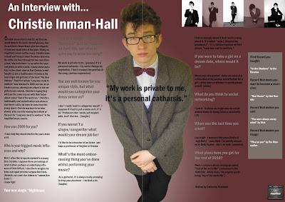
The title of my magazine is “Amplified.” This fits in with the genre of my magazine which is Indie Rock/Pop music and the artists in this genre use amps and guitars. The models who feature in my magazine are wearing clothing that would normally be associated with the Indie Rock/Pop genre of music and how artists would dress in magazine such as Q and NME. My front cover picture included a guitar which often is featured in music magazines – this fits in with the genre of the magazine where the artists play guitar. In my Contents page my model is biting tape from a cassette – once again this fits in with the magazine being a music magazine and makes it individual.The colour scheme of my magazine is black, white and burgundy. This challenges the forms and conventions of music magazine because often a lot of colour is used and burgundy isn’t a colour that is normally used. I wanted to make my magazine individual and different so therefore I thought the colour burgundy would suit my magazine. The music artists are represented as being confident, professional and relaxed. This conforms to the forms and conventions of real media products. The genre of my magazine is Indie Rock and Pop. This is shown because of the title of the magazine and the models are wearing Indie style clothes and the front cover picture includes a guitar. The bands included are from the Indie Rock/Pop genre. This uses the conventions of music magazines because lots of magazine are from this genre and use the previous techniques to show this. The font and style of my magazine is very consistent. The same font is used throughout but different sizes and font colours are used. This challenges the conventions because normally a variety of fonts are used but at the same times conforms because it looks consistent and there is a variety of different styles.
The layout of the front page uses the conventions of a real music magazine. The picture is in the centre with the title of the magazine in big above it. A strip line is used and a variety of article headings. The Contents Page includes a variety of pictures, headings and numbers which are convention of a magazine. To make my magazine different the title of the page is along a strip line of pictures on the left hand side. The double page spread uses conventions of a music magazine such as a large picture.
Thursday, 15 April 2010
Evaluation Task 2

On the left is an image of Katie White from the Indie band the "Ting Tings" and on the right is the model Hannah on the front page of my magazine "Amplified."Katie and Hannah are both similar weight and height and wear little make-up. Despite some physical differences they are both looking away from the camera to show an element of secrecy and mysteriousness. They are both young musicians who play Indie Rock/Pop music which is the genre of music that my magazine features. Although Katie is wearing more extravagant, individual clothing than Hannah, they are both holding their guitars which not only fits in with the genre of the magazine but shows their rebellious "rock chick" appearance. Despite a female being featured on the front page of my magazine I still think my magazine appeals to both men and women because of the colour scheme and because the model isn't made to look overly girly.
Subscribe to:
Comments (Atom)


